case study

Sweet, Sour, & Salty is a fictional brand of aguas frescas that are just a bit sweet, sour, and salty. They are simple, refreshing fruit drinks inspired by the hand‑painted rótulos found throughout Mexico. The goal was expand the packaging into an interactive and lively website that celebrates this vibrant street‑art tradition with bold lettering, bright color, and an easygoing personality that reflects the drinks themselves.
gathering content

Before designing, I gathered the content. I gathered product information and design elements that information would best convey my message. 

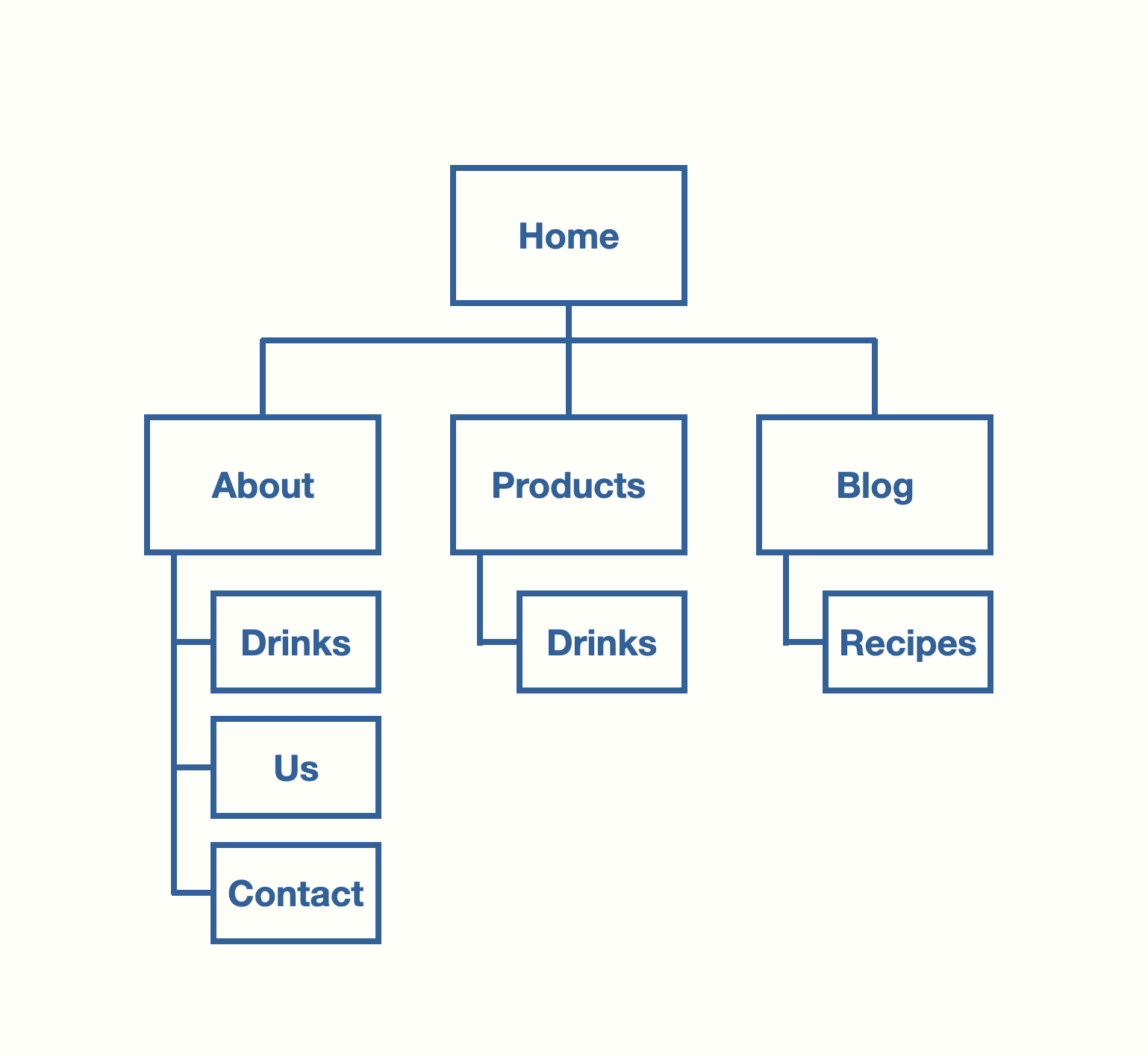
SIte map

site map

Developing a site map was helpful while gathering content for the site

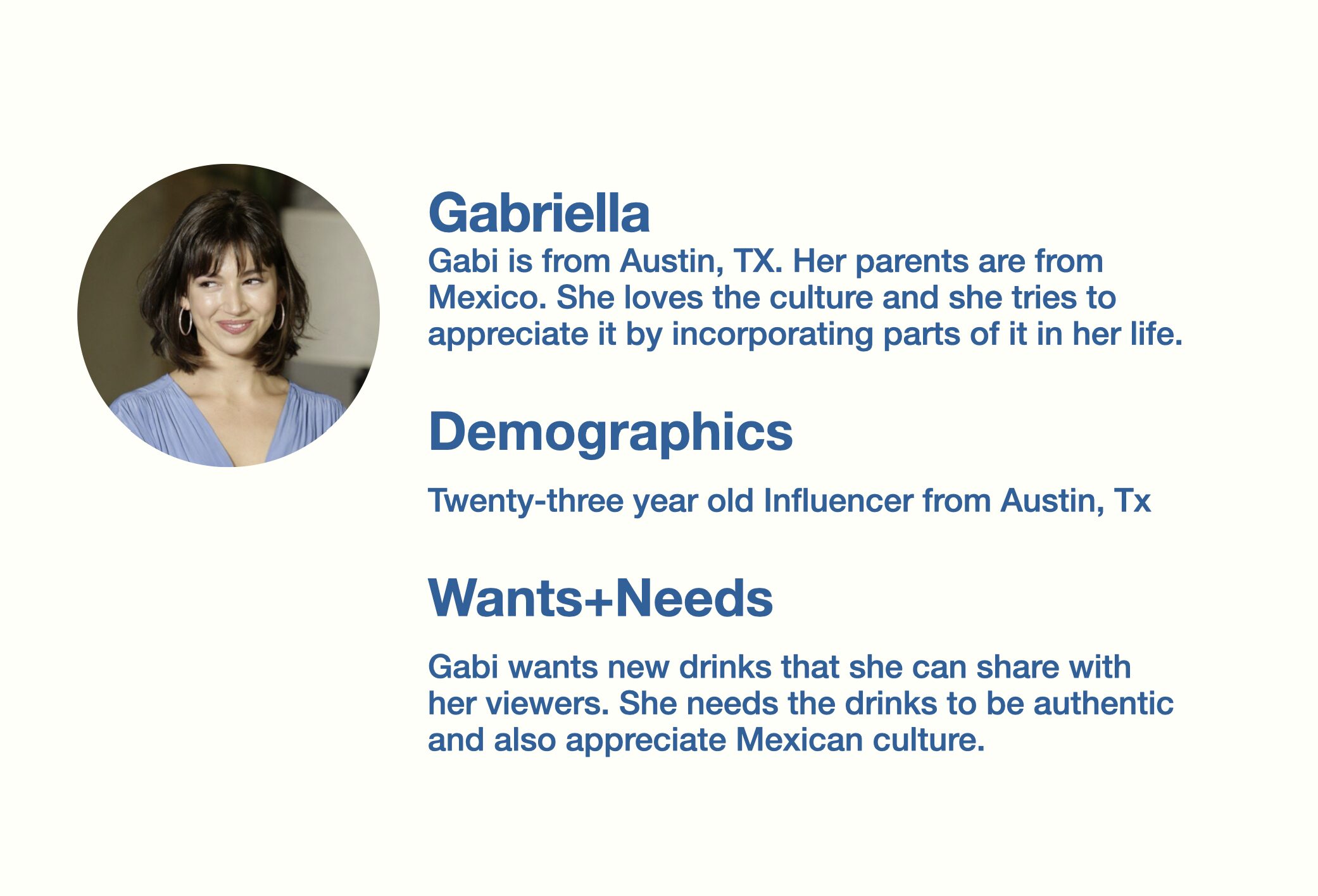
persona

sweet sour and salty persona with photo

wireframes

prototype

home-prototype
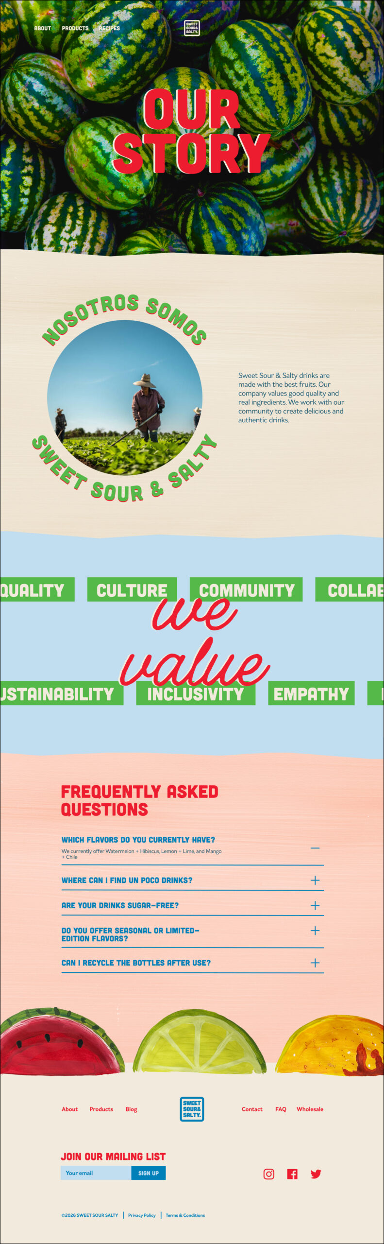
about-prototype
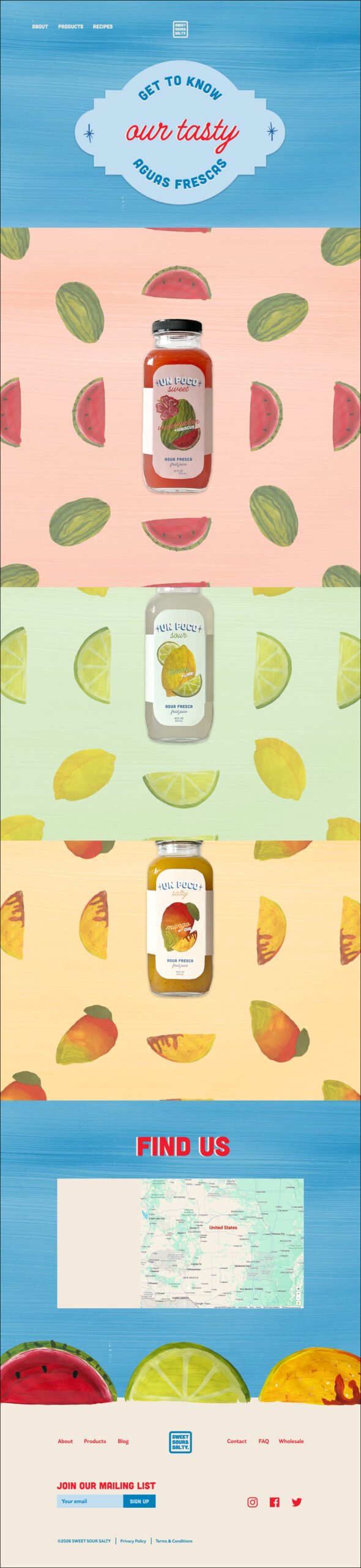
products-prototype
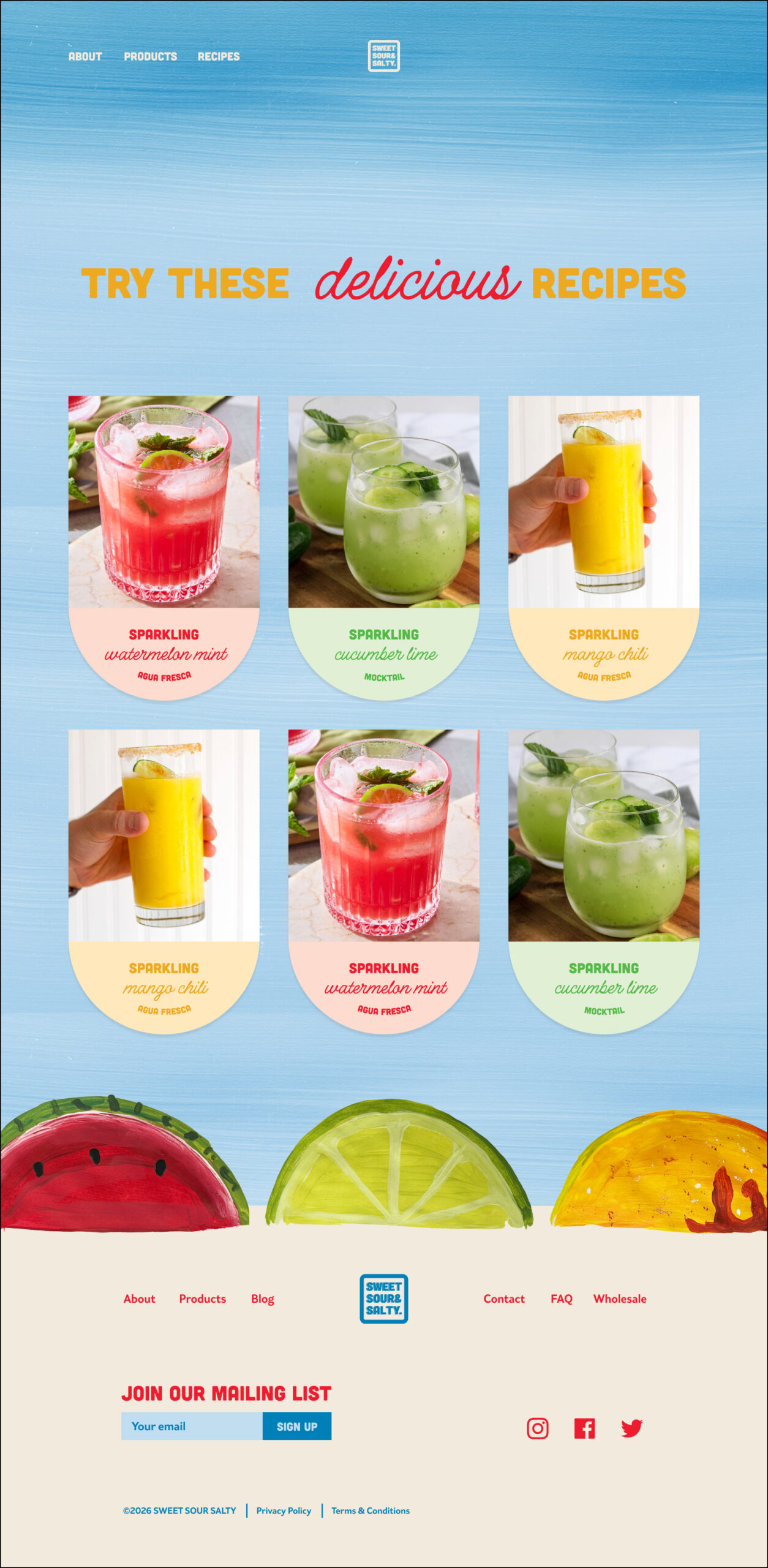
recipes-prototype

final

conclusion

I enjoyed this project and being able to expand an old project. I had fun designing with the colors and elements I had already set. This project pushed me to go out and search for ways to create what I envisioned.